About Impressionism
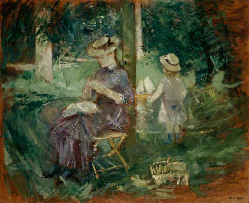
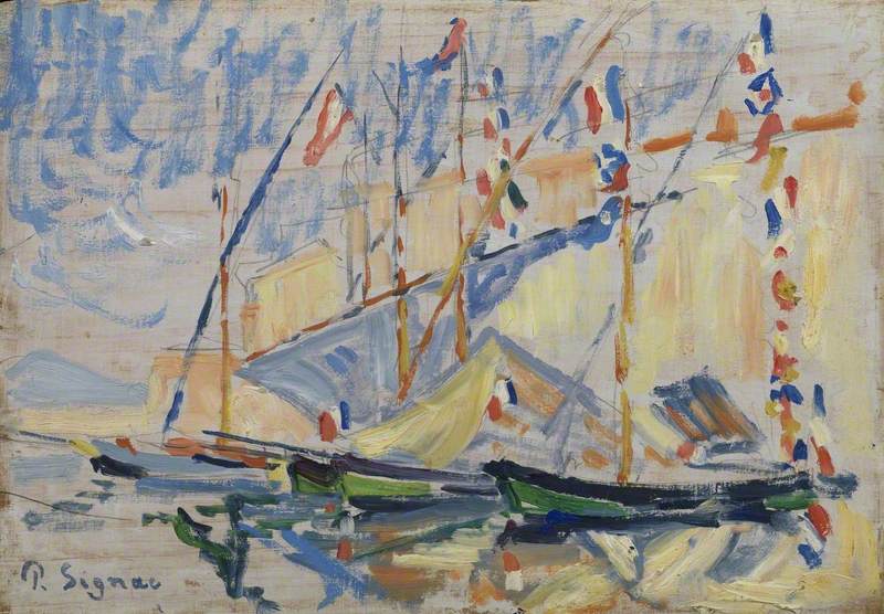
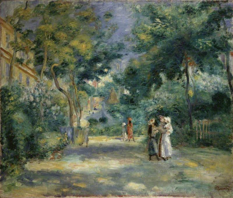
Impressionism was a style of painting that emerged in the late nineteenth century in France. Characterised by loose brushstrokes and bright or pastel colours, it is perhaps one of the best-known art movements in art history and paved the way for modern painters in the twentieth century.
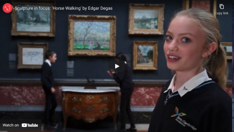
Watch this National Galleries of Scotland video for a brief introduction to Impressionism, then find out more about the movement through the themes below.
Modern life
Impressionism started in the 1860s when a group of young artists decided they wanted to capture their impression of the things they saw around them – rather than subjects from history or mythology that artists were traditionally 'supposed to' paint.
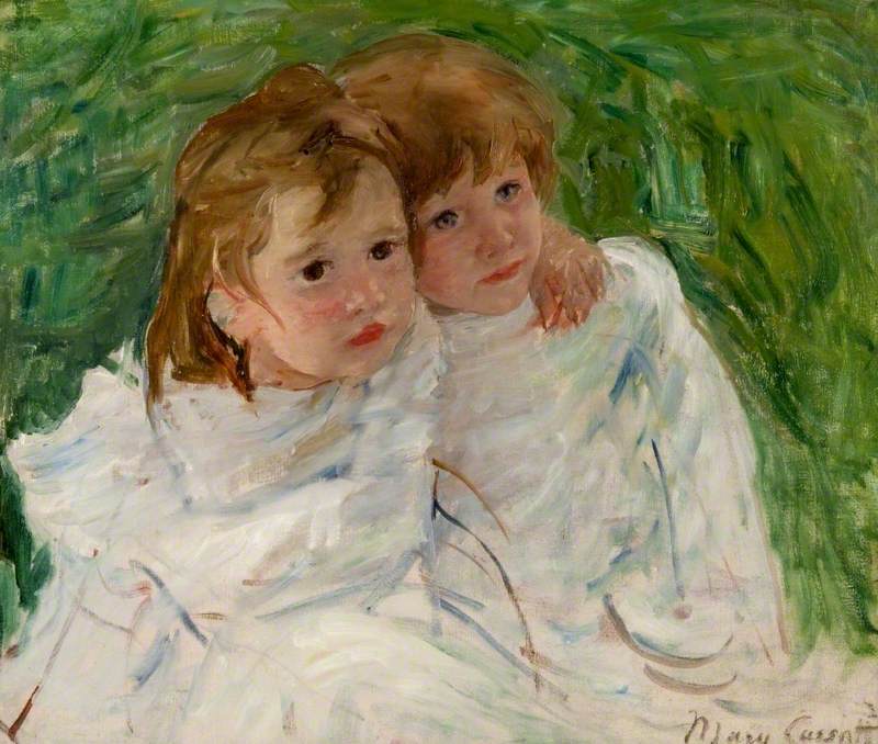
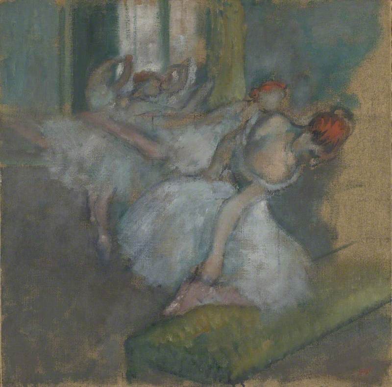
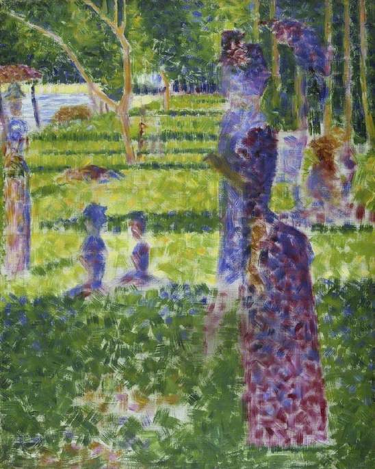
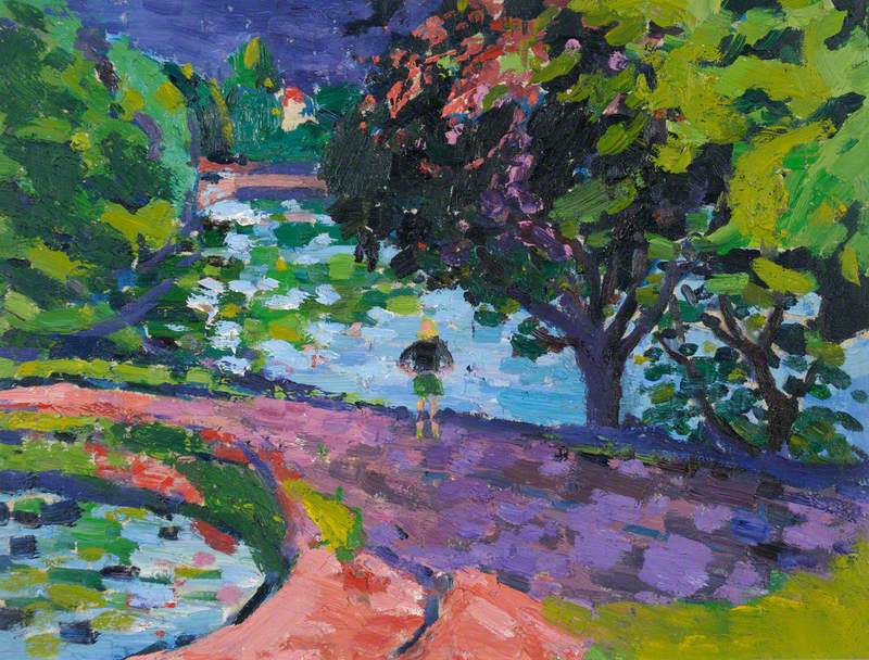
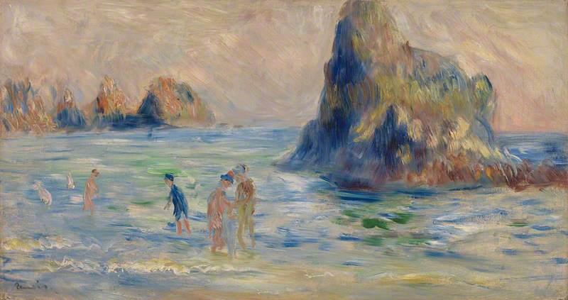
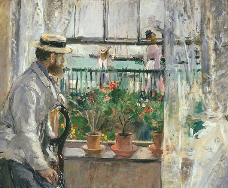
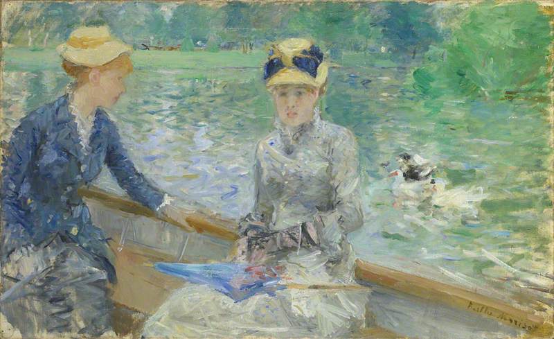
The Impressionists were especially interested in capturing scenes of contemporary life. They painted busy streets, bustling bars and cafés, and people dancing or relaxing in public parks.
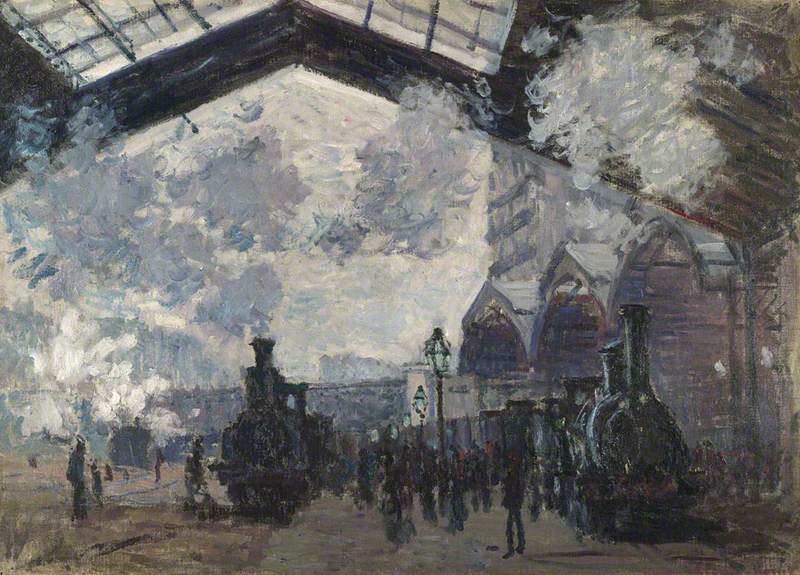
They also painted exciting new technological developments such as railway stations and steam trains.
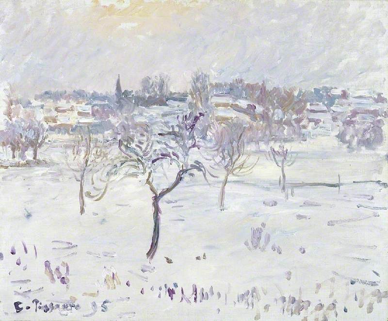
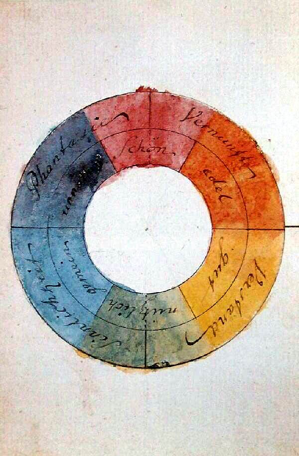
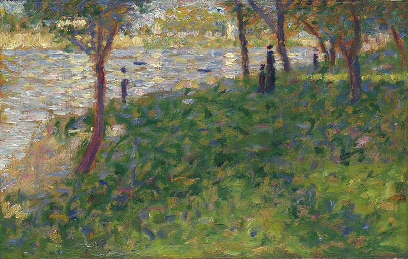
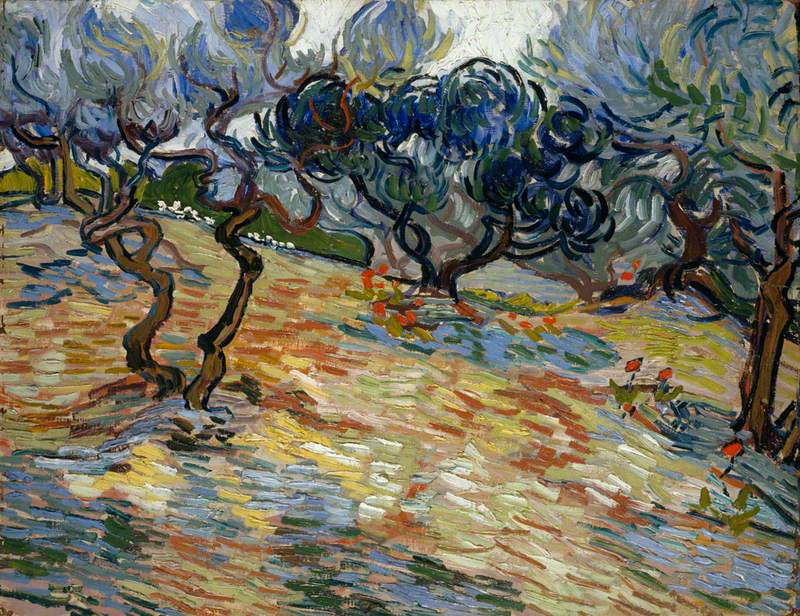
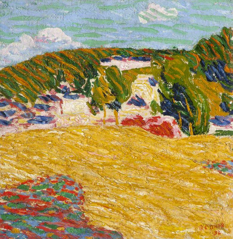
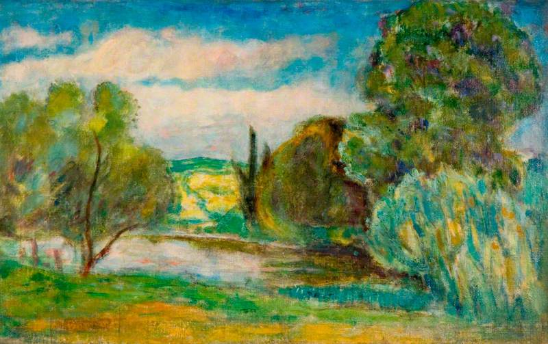
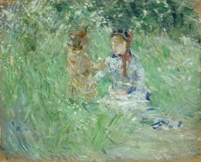
Impressionist painters often worked outside in the open air (an approach known as 'en plein air' – a French phrase that translates as 'outdoors'). They wanted to put down on canvas the changing light and colours of a scene at a particular moment in time and paint their overall impression of a scene rather than its details.
They also, importantly, wanted to capture, with loose expressive brushstrokes, how what they saw made them feel.
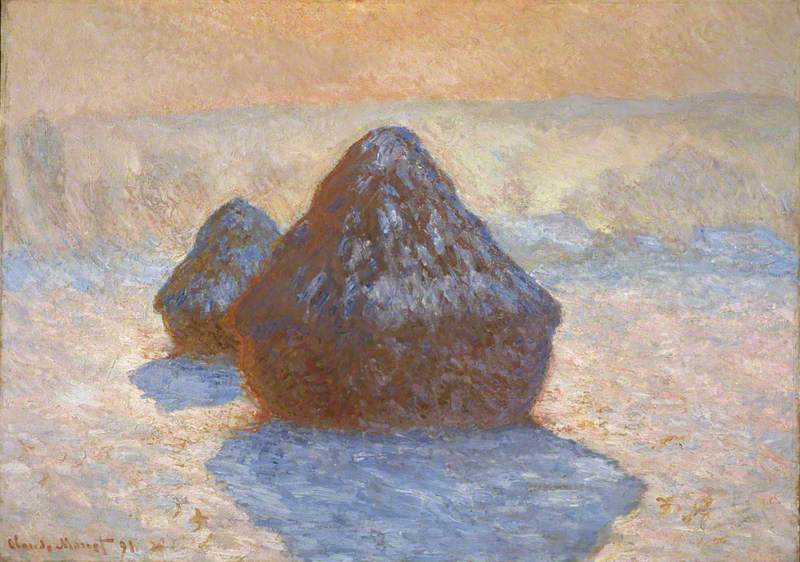
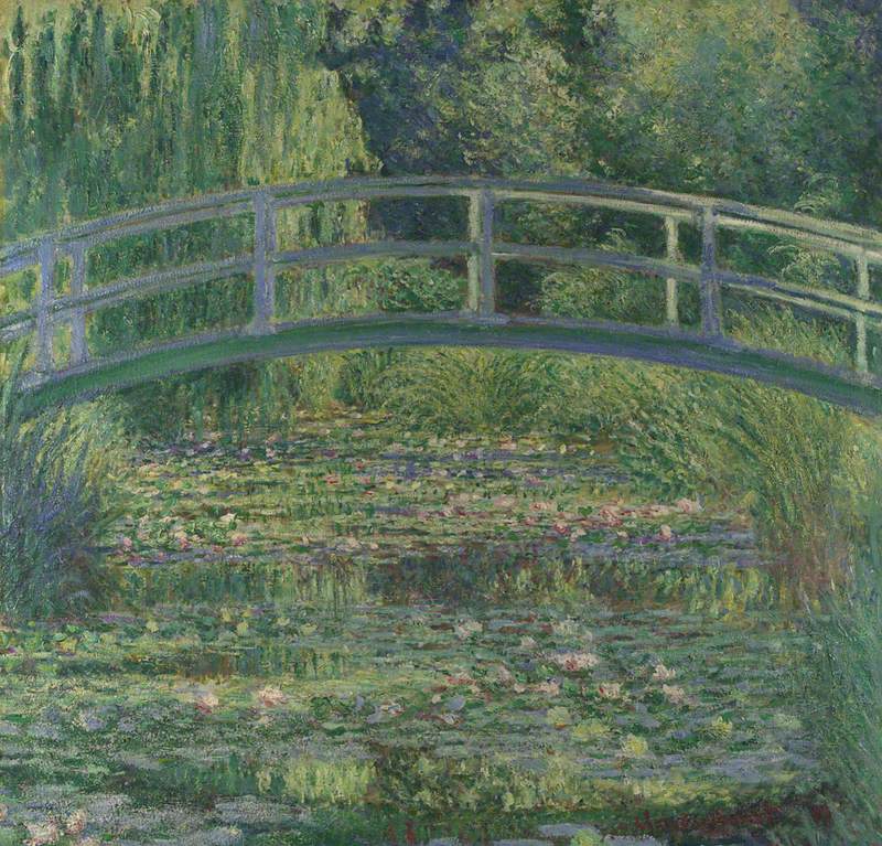
Rouen Cathedral: Setting Sun (Symphony in Pink and Grey)
1892–1894
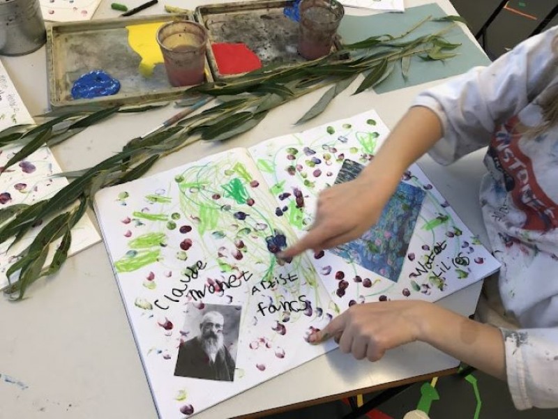
Claude Monet (1840–1926)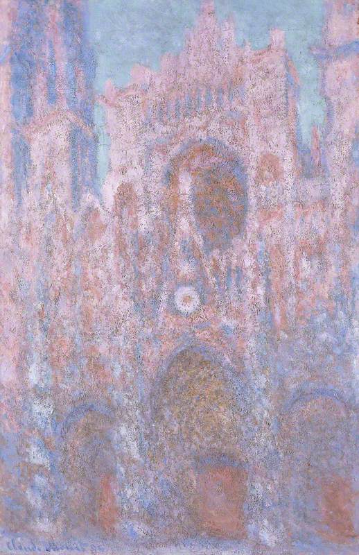
A break with tradition
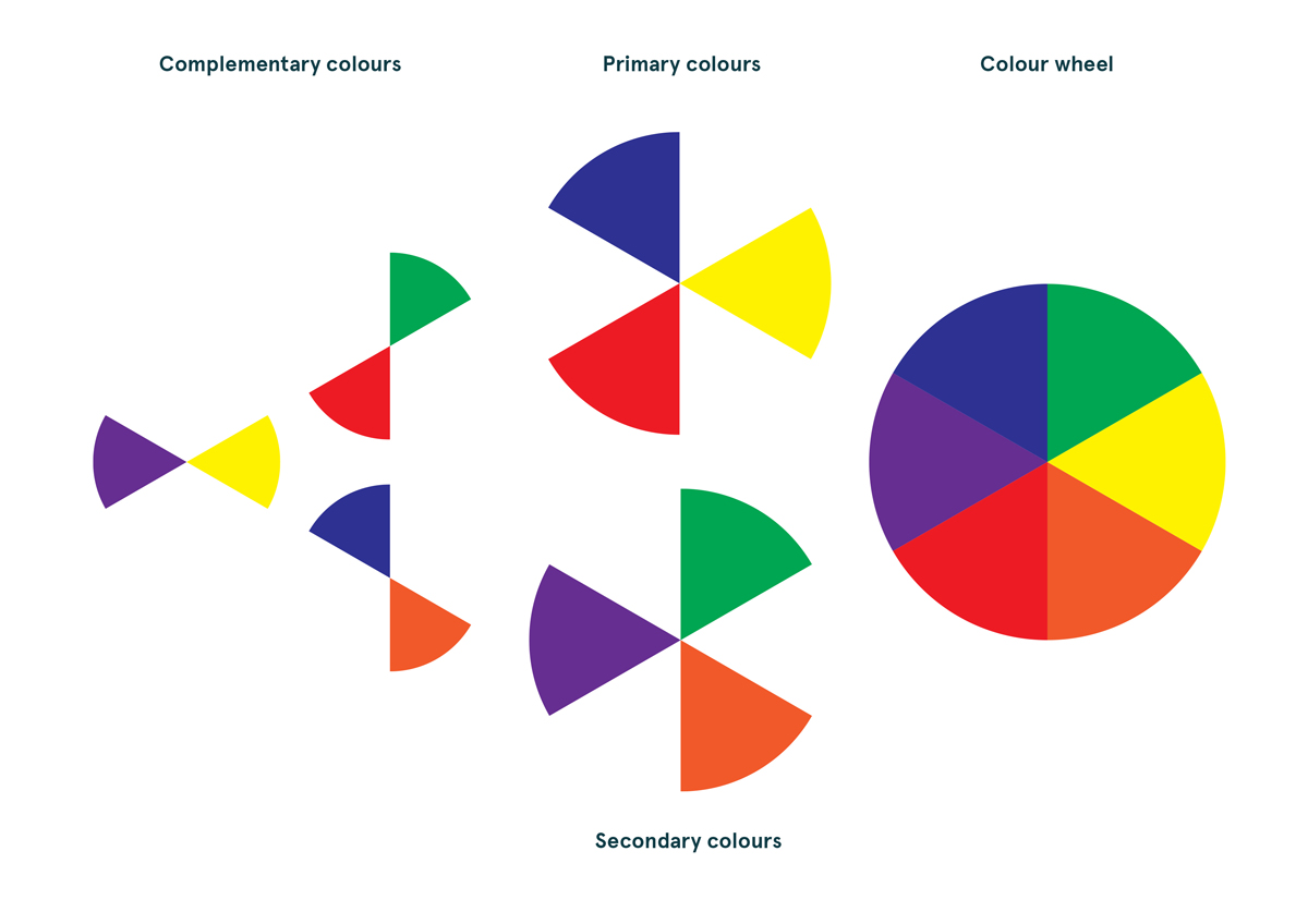
'There are no lines in nature, only areas of colour one against another.' – Edouard Manet
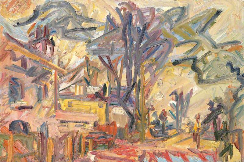
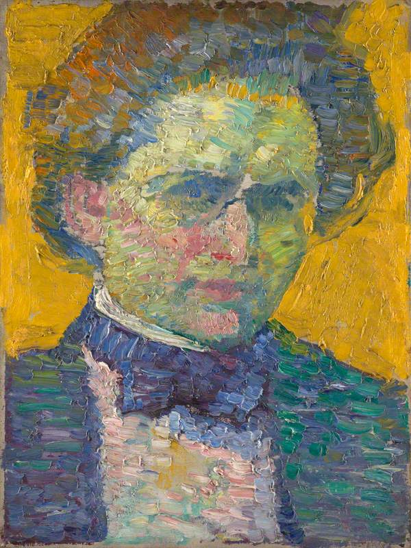
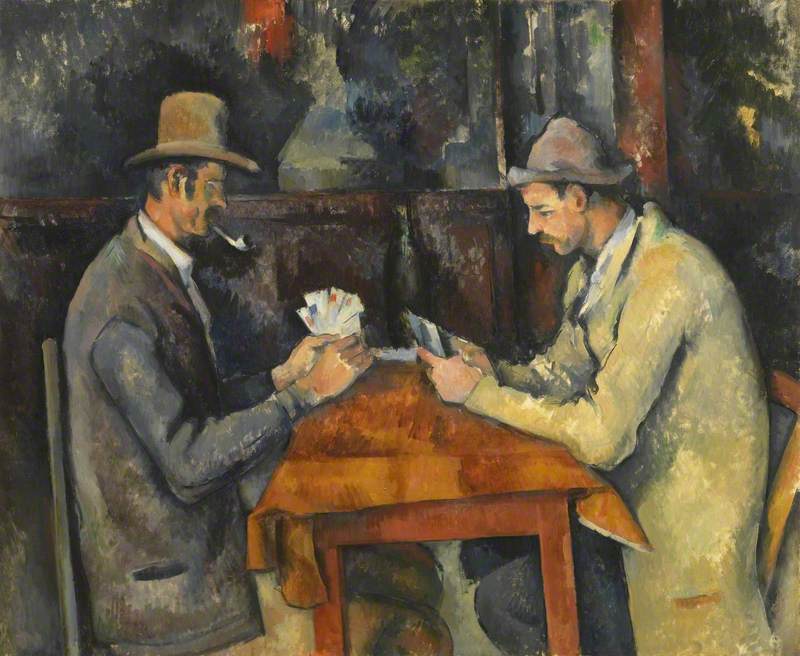
Impressionist artists moved away from using realistic perspective, contours to indicate form and three-dimensional tonal effects. Their technique of using short, or gestural brushstrokes to break up the surface of their paintings makes them look abstracted.
This was a very different approach to the dominant style of painting in the nineteenth century. The French art world of the 1850s and 1860s was controlled by the Académie des Beaux-Arts (the Academy of Fine Art in Paris). The Academy thought paintings should look realistic and be neatly finished so the brushstrokes couldn't be seen. They championed dark, more sedate colour palettes (which looked serious and formal).
The Academy also thought that serious artists should only paint certain subjects. They listed subjects in order of importance and at the top of the list were historical subjects (such as scenes from Greek or Roman mythology, battle scenes or other significant historical events). Religious themes were considered the next most important subject followed by portraits (of important people).
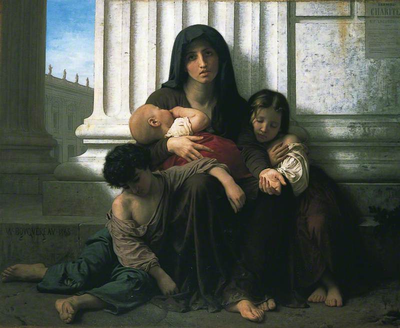
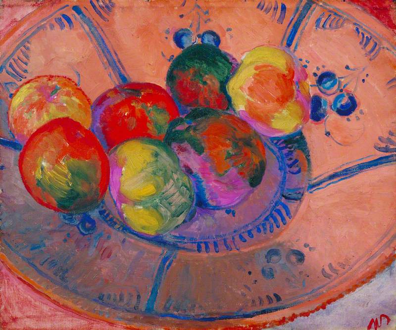
At the bottom end of the list, were landscapes, still life paintings, and scenes of everyday life (often referred to as 'genre' scenes). These were the very subjects that attracted the Impressionists.
When the Impressionists first had an exhibition of their work in 1874, the response from the traditional art world, critics and the public was overwhelmingly negative. They thought Impressionist paintings looked unfinished and amateurish. One critic wrote:
'Wallpaper in its early stages is much more finished than that.'
Impressionism and modern art
Impressionism is generally thought of as the first modern art movement which paved the way for the development of abstraction in the twentieth century. Their interest in the abstract properties of colour and light showed that painting didn't have to look realistic.
Their focus on how we see was key to Cubist ideas and the later Op Art movement. By allowing for the expression of individual ideas and emotions, they opened the door for Fauvism and other expressionist movements of the twentieth century.
Did you know?
The term 'Impressionism' was originally a criticism.
Art critic Louis Leroy wrote a negative review of Impressionist painting in which he mockingly twisted the title of one of Claude Monet's paintings – Impression, soleil levant (Impression, Sunrise) to coin the term 'Impressionism'.
Find out more about Impressionism